

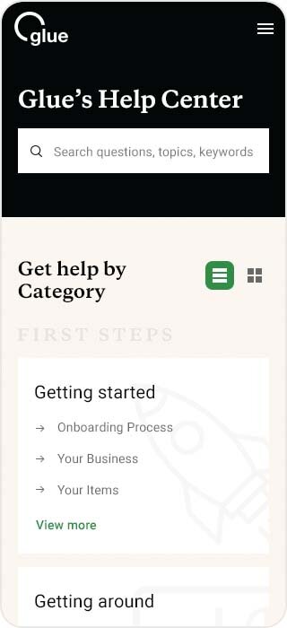
Make it easy for users to find the information they need
After Glue’s website was launched with only a few main site pages, users had started to contact customer service with repeating questions. That was the moment a new mission landed at my doorstep - to build the company the best help center experience i can think of. There were no specific guidelines, except to understand the way users search for information and facilitate this process for them.
VISIT WEBSITE →
ROLE
User Experience
Visual Design
User Testing
DATE
2021

Me, starting the research process
1. VISUAL IDENTITY
Maintaining the existing design system elements, With a few needed additions
Continuity is crucial
At the time I began working on this project, Glue's website was already live and had an established brand language and identity. Therefore I knew it was crucial to follow the existing elements wherever possible.
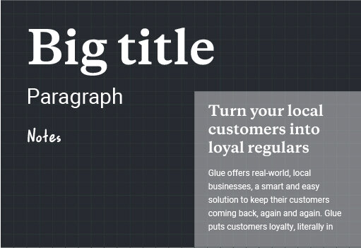
Putting it all together, I added two additional headline types to improve content hierarchy and scanning capabilities
TYPOGRAPHY

COLORS


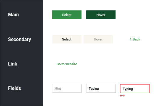


A small part of Glue’s design system
2. USERS & MARKET RESEARCH
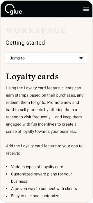
Dividing content into distinct categories
Data from customer service
My first step was to talk to our customer service team to get a better understanding of our users in order to create the best help center experience for them.
I had to understand their main challenges, how they began engaging with our products, which customer types are most common, and what are the most complicated actions they had to deal with.
Market research
Additionally, I reviewed a number of companies that also offered loyalty programs to small businesses, and companies from parallel fields that provided different digital tools for users with similar characteristics to ours.
I started analyzing their knowledge base and categorizing system to better understand their users' search process.
I then created several concepts for the help center's basic structure


Different concept sketches to visually understand our best options
3. CHALLENGES & INSIGHTS
While some users scan content better via "Topic", others scan better via "Category"
After talking to the customer service team, we realized we had to find a solution that addresses two different types of users we spotted on our user testing.
I come up with this view option to give users different options for viewing content, so they can find it according to their preferences.

Toggling between two view options
Some users know exactly what they are looking for
For those users, we gave the ability to search information using keywords and suggest optional results as they type, before they reach the results page

Optional results dropdown while typing to simplify the search process
A large number of the users come from mobile devices
Since former data showed us the main user traffic is on mobile devices, we put a lot of effort into our site's mobile version, making it easy to use on the go.
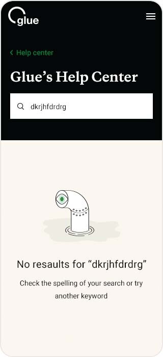
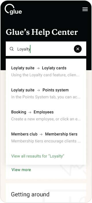
Selected screens from the mobile search process
